What A/B Testing Reveals About Your UI Design
Create Account
Have an account? Login
UI/UX designers often rely on a mix of creativity, empathy, and best practices. But here’s the truth: even the most intuitive design can fail if it doesn’t align with real user behavior. That’s where A/B testing becomes a designer’s secret weapon, turning assumptions into insights and helping you design with evidence, not just aesthetics.
Why Intuition Alone Doesn’t Work
Design is subjective. What looks “clean” to a designer might feel “empty” to a user. What feels like a bold, modern CTA color may be interpreted as “aggressive” or “untrustworthy.”
According to HubSpot research, even small design decisions can dramatically shift performance; for example, one test showed a red button outperformed a green button by 21% in conversions. The lesson? Designers need data to validate decisions.
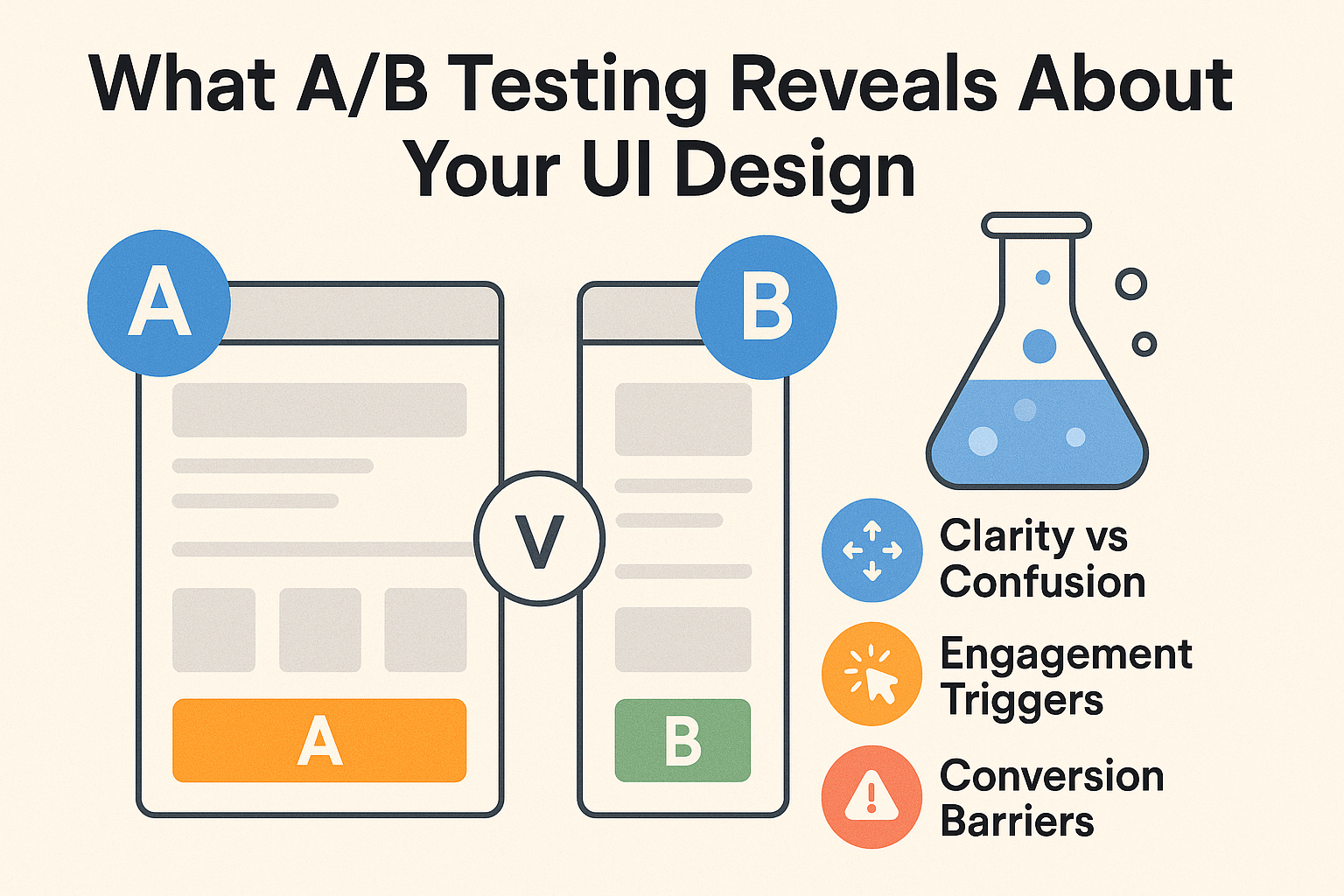
A/B Testing: The Designer’s Microscope
A/B testing is like putting your design under a microscope. By showing two versions of a page element to different audiences, you uncover:
-
Which copy increases clarity
-
Which layouts improve flow
-
Which visuals build trust
It’s not just about what “looks better.” It’s about what helps users achieve their goals faster and more seamlessly.
What A/B Testing Reveals for Designers
-
Clarity vs. Confusion
A simple change in navigation labels can reduce drop-offs. Example: “Bootcamps” vs. “Courses.” -
Engagement Triggers
Users often respond better to microcopy that emphasizes benefits.
“Sign Up” → “Get My Free Lesson” can boost engagement. -
Conversion Barriers
Long forms feel overwhelming. Tests often show that reducing fields from 10 to 4 increases completions by 50% or more. -
Visual Preferences
Colors, imagery, and typography are not just aesthetics; they’re signals of trust. Testing helps you decode what your audience feels safe with.
Real-World UI Testing Examples
-
Menu design: Icon-only hamburger vs. labeled navigation.
-
CTA copy: “Enroll Today” vs. “Start Your Journey.”
-
Form flows: Inline form vs. multi-step with progress bar.
-
Imagery: Stock photos vs. authentic student photos.
Each test provides insight into user psychology, what reassures them, what distracts them, and what drives them forward.
Best Practices for Designers Running A/B Tests
-
Test one variable at a time. If you change color, copy, and layout at once, you won’t know what worked.
-
Run tests until statistically valid. Cutting tests too early leads to false confidence.
-
Use meaningful metrics. Designers should care not just about clicks, but about task completion, sign-ups, and reduced friction.
-
Document learnings. Build an internal “design playbook” from test results to inform future projects.
Pitfalls Designers Should Avoid
-
Chasing quick wins. A color change might give a lift, but fixing navigation flow may yield a bigger impact.
-
Forgetting audience context. What works for Gen Z learners may not work for mid-career professionals.
-
Designing for vanity metrics. A “pretty” button isn’t a win if users still abandon the page.
Iteration: The Designer’s Superpower
A/B testing shouldn’t be a one-off exercise. The strongest designers build continuous testing into their workflow:
Prototype → Test → Measure → Iterate → Repeat.
This cycle turns your design process into a growth engine, always learning, always evolving.
Why This Matters for Your Career as a Designer
Employers don’t just want creative designers. They want designers who think like product strategists, who can connect design choices to business outcomes.
Mastering A/B testing sets you apart. It shows you can balance aesthetics with performance and artistry with analytics.
Ready to add data-driven validation to your design skills?
Our UX/UI Design Bootcamp at Workforce Institute teaches you how to design, test, and optimize experiences that don’t just look good — they work.